
In this tutorial,We are going to show you some unique button hover effects that just may surprise you.Today I'm sharing a step by step tutorial for 5 custom Divi buttons with a nice hover effect to Divi Button module to anywhere on your website.
Style 1
Style 2
Style 3
Style 4
Style 5
Steps for HOVER Effect with DIVI Button Module
Step 1. Download BUTTON_HOVER_EFFECTS.zip File
Step 2. Unzip Zip Folder
Step 3. Import Divi_Button_Module_With_5_Creative_Hover_Effects.json file on on Divi -> Divi Library -> Import & Export Button
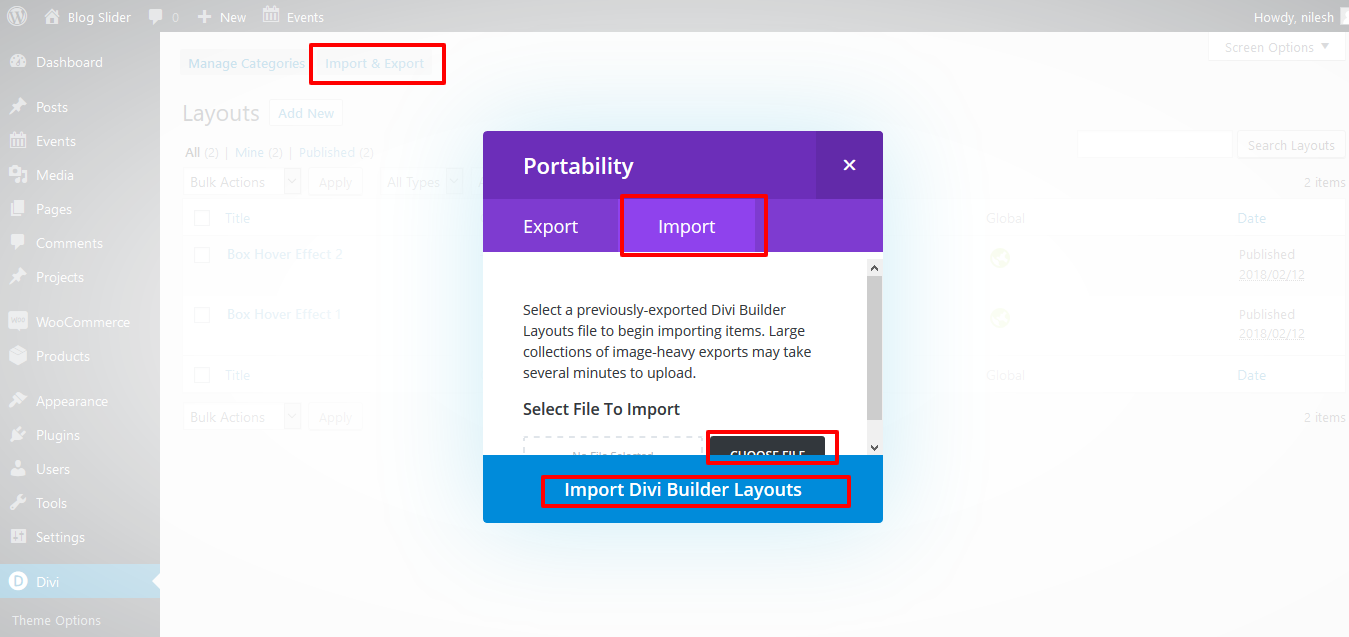
Step 4. After import layout json files you can see in below

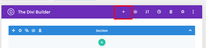
Step 5 : Create New Page > Click on “+” Icon see below image
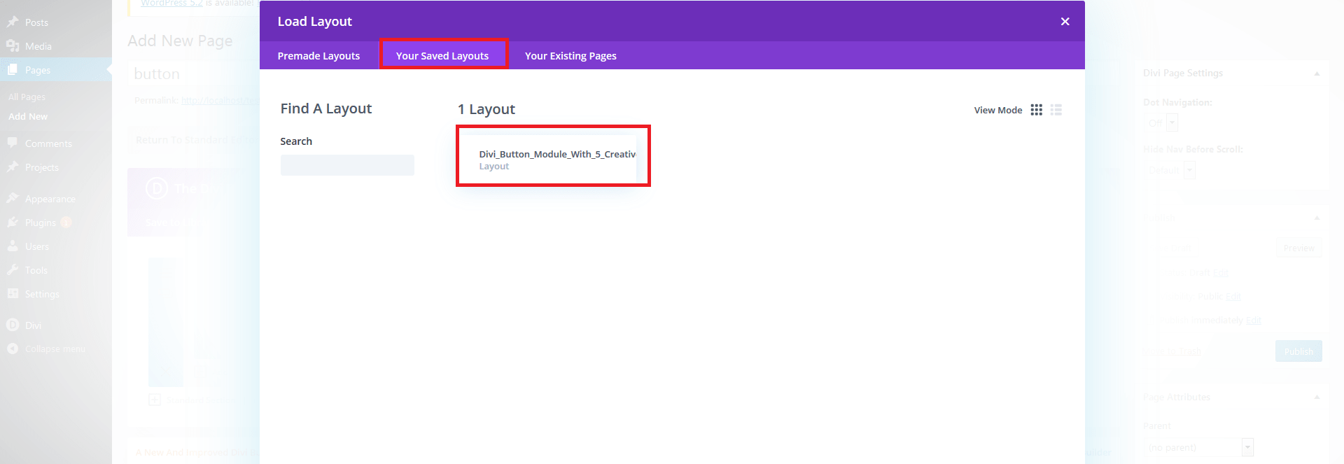
Step 6. After click ,layout will be load then Publish Page
Step 7. Here two way possibility of use tilt .
1. Using Child theme
On unzip folder you can found Child Theme folder “BUTTON_HOVER_EFFECTS.zip” file so just upload and activate.
If child theme already exist then follow below step
-> Copy enqueue script function “DCT_BUTTON_HOVER_EFFECTS” code and paste on your existing child theme functions.php file.
-> Copy style.css code and paste on your existing child theme style.css file.
DCT_BUTTON_HOVER_EFFECTS In Function.php
function DCT_BUTTON_HOVER_EFFECTS() {
wp_enqueue_style( 'button-hover-effect', get_stylesheet_directory_uri() . '/DCT_BUTTON_HOVER_EFFECTS.css' );

}
/* Add Front-Site Css
-------------------------------------------------------------- */
add_action( 'wp_enqueue_scripts', 'DCT_BUTTON_HOVER_EFFECTS' );
2. Without Child theme
-> Upload “DCT_BUTTON_HOVER_EFFECTS.CSS” file on your server or anywhere and add that path on Divi-> Theme Options -> GENeRAL Tab.
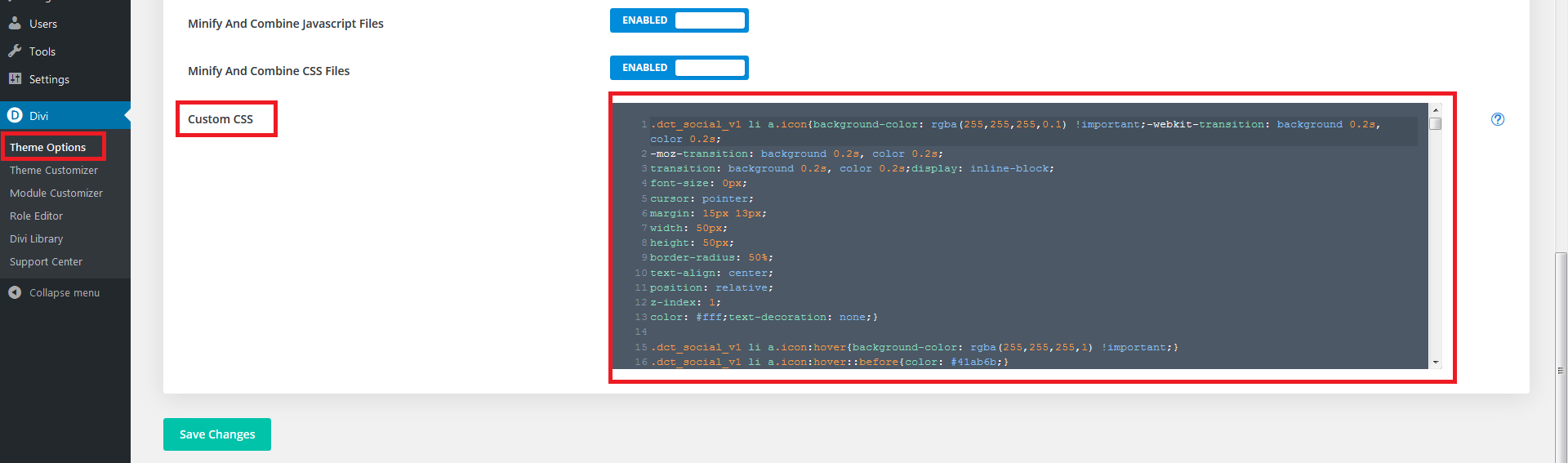
-> Copy CSS code from FOLDER file and paste on Divi-> Theme Options -> GENeRAL Tab -> Custom CSS.
Just PASTE CSS code in CUSTOM CSS TAB AND SAVE IT.
See image
1. DIVI Button module hover STYLE 1
.dct_btn_v1{


z-index: 2;
background: #000000;
border:none;
border-radius:0;
color: #fff;
text-transform: uppercase;
text-align: center;
padding: 7px 30.5px;
position: relative;
outline: none;
font-weight: 600;
font-size: 15px;
transition: all 0.4s ease-out !important;
-moz-transition: all 0.4s ease-out !important;
-webkit-transition: all 0.4s ease-out !important;
-ms-transition: all 0.4s ease-out !important;
-o-transition: all 0.4s ease-out !important;}

.dct_btn_v1:hover{color: #fff;padding: 7px 30.5px !important;border:none !important;}

.dct_btn_v1.dark{background-color:#fff !important;color: #111 !important;}
.dct_btn_v1.dark:hover{color: #fff !important;}

.dct_btn_v1.et_hover_enabled:hover::after{transition: all 0.4s ease-out !important;z-index: -1;}


.dct_btn_v1::after{content: "";
width: 4px;
height: 100%;
position: absolute;
right: 0;
top: 0;
opacity:1;
z-index:-1;
background: #ffc300;
transition: all 0.4s ease-out !important;
-moz-transition: all 0.4s ease-out !important;
-webkit-transition: all 0.4s ease-out !important;
-ms-transition: all 0.4s ease-out !important;
-o-transition: all 0.4s ease-out !important;}

.dct_btn_v1:hover::after{width: 100%;transition: all 0.4s ease-out !important;
-moz-transition: all 0.4s ease-out !important;
-webkit-transition: all 0.4s ease-out !important;
-ms-transition: all 0.4s ease-out !important;
-o-transition: all 0.4s ease-out !important;}


.dct_btn_v1.pink::after{background: #eb3b5a;}

.dct_btn_v1.green::after{background: #20bf6b;}


  .dct_btn_v1.blue::after{background: #1b67a9;}
2. DIVI Button module hover STYLE 2
.dct_btn_v2.et_hover_enabled:hover::after{transition: all 0.4s ease-out !important;z-index: -1;}

.dct_btn_v2{
letter-spacing: 1px;
color: #fff !important;
text-transform: uppercase !important;
  padding: 7px 30.5px;
background-color: #000;display: inline-block;box-shadow: 0px 2px 18px 0px rgba(0,0,0,0.3);overflow:
  hidden;
  font-size: 15px;

font-weight: 600;
  backface-visibility: hidden;
  transition: all 0.4s ease-out !important;
-moz-transition: all 0.4s ease-out !important;
-webkit-transition: all 0.4s ease-out !important;
-ms-transition: all 0.4s ease-out !important;
-o-transition: all 0.4s ease-out !important;

  }


.dct_btn_v2:hover{border: 2px solid transparent;padding: .3em 1em !important;padding: 7px 30.5px !important;}

.dct_btn_v2:after{line-height: 1.7em;
font-size: 1em !important;
content: attr(data-icon);
left: -100% !important;
top: 0%;
margin-left: 0em !important;
position: absolute;
height: 100%;
width: 100%;
background-color: #ffc300;
text-align: center;
  transition: all 0.4s ease-out !important;
-moz-transition: all 0.4s ease-out !important;
-webkit-transition: all 0.4s ease-out !important;
-ms-transition: all 0.4s ease-out !important;
-o-transition: all 0.4s ease-out !important;

  }


.dct_btn_v2:hover:after{line-height: 3em !important;top: 0;left: 0 !important;transition: all 0.4s ease-out !important;
-moz-transition: all 0.4s ease-out !important;
-webkit-transition: all 0.4s ease-out !important;
-ms-transition: all 0.4s ease-out !important;
-o-transition: all 0.4s ease-out !important;}


.dct_btn_v2.up::after{background-color: #eb3b5a;left: 0 !important;top: -100%;	}
.dct_btn_v2.up:hover::after{top: 0;}

.dct_btn_v2.down::after{background-color: #20bf6b;left: 0 !important;bottom: -100%;top: auto;}
.dct_btn_v2.down:hover::after{bottom: 0% !important;}


.dct_btn_v2.right::after{background-color: #1b67a9;right: -100% !important;top: 0%;left: auto !important;}
.dct_btn_v2.right:hover::after{top: 0;right: 0 !important;}
3. DIVI Button module hover STYLE 3
.dct_btn_v3{background: linear-gradient(135deg,#8300e9 0%,#0c71c3 100%);
color: #fff;
font-weight: 600;
font-size: 16px;
border: 0;
border-radius: 0px;
padding: 7px 30.5px;
text-transform: uppercase;
overflow: hidden;}

.dct_btn_v3:hover{color: transparent;
background: linear-gradient(135deg,#8300e9 20%,#0c71c3 100%);
padding: 7px 30.5px !important;border: none !important;}


.dct_btn_v3:hover:before{width: 140%;}
.dct_btn_v3:hover:after{position: absolute;
opacity: 1;
left: 0%;
width: 100%;
margin: 0;
text-align: center;
bottom: .5em;}


.dct_btn_v3:before{content: "";
position: absolute;
display: block;
top: 0;
bottom: 0;
left: -20%;
width: 20%;
text-align: center;
background: #fff;
opacity: 0.1;
transform: skew(-10deg);
transition: .8s ease all;}

.dct_btn_v3:after{position: absolute;
color: #fff;
opacity: 1;
left: 0% !important;
width: 100%;
text-align: center;
margin: 0 !important;
bottom: -30px;}


.dct_btn_v3.green,.dct_btn_v3.green:hover{background: linear-gradient(135deg,#478212 0%,#74cc27 100%);}

.dct_btn_v3.red,.dct_btn_v3.red:hover{background: linear-gradient(135deg,#e02022 0%,#f35656 100%);}

.dct_btn_v3.blue,.dct_btn_v3.blue:hover{background: linear-gradient(135deg,#0149CC 0%,#00C6FF 100%);}
4. DIVI Button module hover STYLE 4
.dct_btn_v4{

    color: #ffc300;

   font-size: 16px;
    letter-spacing: 1px;
   text-transform: uppercase; padding: 12px 20px 7px;
    border-radius: 0;
    border: 1px solid #ffc300;
    box-shadow: inset 3px 4px 0 #ffc300, 4px 4px 0 #ffc300;
    transition: all 0.5s cubic-bezier(0.1, 0.7, 0.3, -0.1) !important;
}
.dct_btn_v4:hover{
    color: #fff;
    box-shadow: inset 160px 50px 0 #ffc300, 0 0 0 #ffc300;
  padding: 12px 20px 7px !important;
}
.dct_btn_v4.blue{
    color: #3498db;
    border-color: #3498db;
    box-shadow: inset 3px 4px 0 #3498db, 4px 4px 0 #3498db;
}
.dct_btn_v4.blue:hover{
    color: #fff;
    box-shadow: inset 160px 50px 0 #3498db, 0 0 0 #3498db;
}

.dct_btn_v4.green{
    color: #20bf6b;
    border-color: #20bf6b;
    box-shadow: inset 3px 4px 0 #20bf6b, 4px 4px 0 #20bf6b;
}
.dct_btn_v4.green:hover{
    color: #fff;
    box-shadow: inset 160px 50px 0 #20bf6b, 0 0 0 #20bf6b;
}


.dct_btn_v4.pink{
    color: #eb3b5a;
    border-color: #eb3b5a;
    box-shadow: inset 3px 4px 0 #eb3b5a, 4px 4px 0 #eb3b5a;
}
.dct_btn_v4.pink:hover{
    color: #fff;
    box-shadow: inset 160px 50px 0 #eb3b5a, 0 0 0 #eb3b5a;
}
@media only screen and (max-width: 767px){
    .dct_btn_v4{ margin-bottom: 20px; }
}
5. DIVI Button module hover STYLE 5
.dct_btn_v5{
    text-transform: uppercase;

    color: #ffc300;
    border-radius: 0;
	padding: 7px 30.5px;
  font-size: 16px;
    position: relative;
  font-weight: 600;
	border:none;
}
.dct_btn_v5:hover{ color: #ffc300;padding: 7px 30.5px !important;background-color:transparent !important;border: none !important; }


.dct_btn_v5:after{
    content: "";
    width: 100%;
    height: 100%;
	opacity:1;
    border: 2px solid #ffc300;
    position: absolute;
    bottom: 0;
    left: 0;
	font-size:0;
	margin-left: 0;
    transition: width 0.2s ease 0s, height 0.2s ease 0.1s, border-top-width 0.1s ease 0.2s, margin 0.2s ease 0s !important;
}
.dct_btn_v5:hover:after{
    width: 60%;
    height: 0;
    border-width: 0 2px 2px;
    margin: 0 20%;
    transition: width 0.2s ease 0.2s, height 0.2s ease 0.1s, border-top-width 0.1s ease 0s, margin 0.2s ease 0.2s !important;
}


.dct_btn_v5.blue,
.dct_btn_v5.blue:hover{ color: #22ace3; }
.dct_btn_v5.blue:after{ border-color: #22ace3; }


.dct_btn_v5.pink,
.dct_btn_v5.pink:hover{ color: #eb3b5a; }
.dct_btn_v5.pink:after{ border-color: #eb3b5a; }


.dct_btn_v5.green,
.dct_btn_v5.green:hover{ color: #47cf77; }
.dct_btn_v5.green:after{ border-color: #47cf77; }
@media only screen and (max-width: 767px){
    .dct_btn_v5{ margin-bottom: 20px; }
}
-> Copy style code from DCT_BUTTON_HOVER_EFFECTS.css file and paste on Divi -> Theme Options -> General -> Custom CSS .
See Image
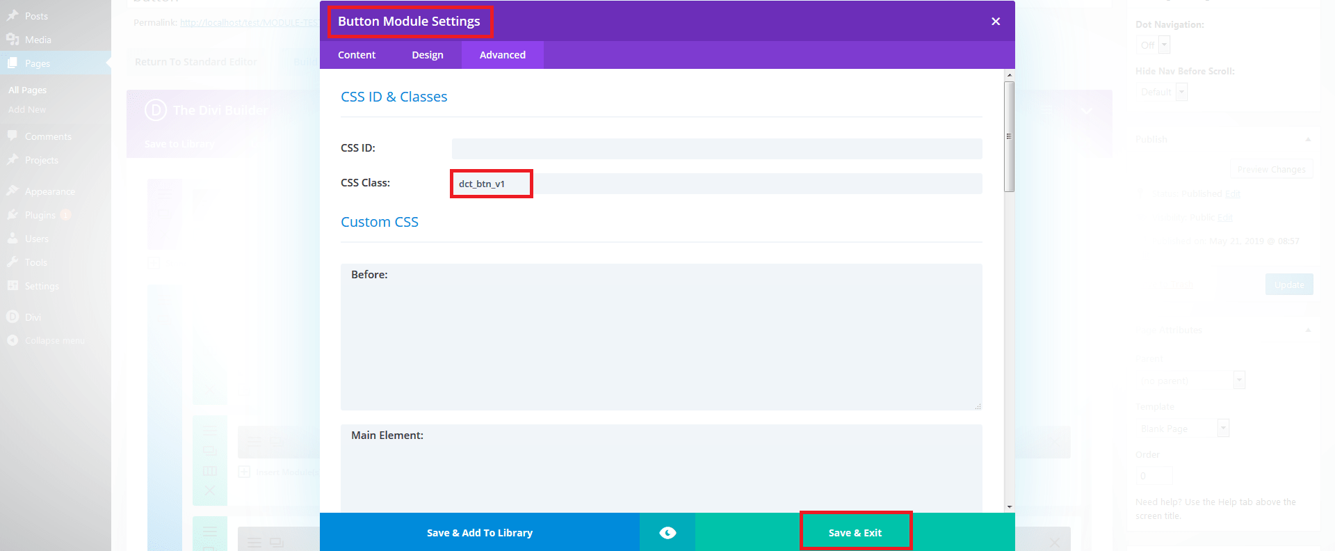
For Simple Effect use class “dct_btn_v1” on bUTTON module .
See Images :